
A financial dashboard for multiple credit cards is a unified visual interface that aggregates balances, due dates, credit utilization, and pending transactions from all your cards into one single-screen view. Managing three, four, or five cards through separate bank portals creates blind spots. You miss a due date on one card while checking another, or you lose track of your total credit utilization across accounts. A multiple card dashboard solves this by pulling everything into one place, updated in near real time. Finja is built around exactly this concept, giving credit card users a consolidated view that replaces tab-switching with clarity.
What is a financial dashboard with multiple cards?
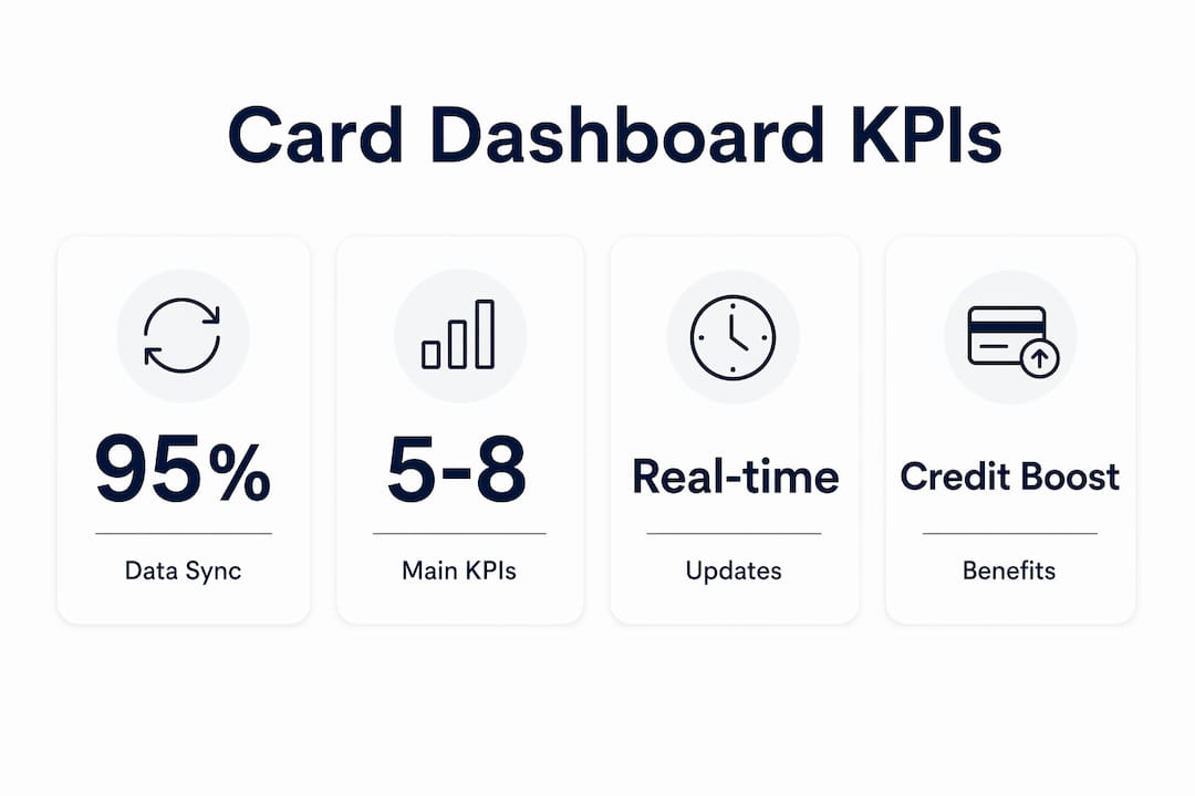
A financial dashboard for multiple cards is the industry's answer to a problem that grows with every card you add to your wallet. The formal term used by fintech designers is a "multi-account aggregation dashboard," but most users simply call it a card dashboard or credit overview. Effective designs recommend displaying only 5–8 primary KPIs on the main view to maintain clarity and avoid data overload. That constraint matters because the goal is fast comprehension, not raw data volume.
The dashboard pulls data from each card issuer through secure aggregators that synchronize account data every few minutes, enabling near real-time insights that traditional bank portals cannot match. You see your Chase balance update alongside your Citi limit and your Amex due date, all without logging into three separate apps. This aggregation model is what separates a true multi-card dashboard from a simple spreadsheet or a single-issuer app.

Each card appears as its own module within the interface. Color-coded status indicators, typically green, yellow, and red, communicate payment urgency at a glance. A 3-column layout is the standard for mobile and tablet views, letting you scan multiple cards side by side without scrolling through a long list.
How does a multi-card dashboard work?
The layout of a well-designed multi-card dashboard follows a nested architecture. Summary cards sit at the top of the screen and show your total outstanding balance, combined credit utilization, and the next payment due across all accounts. Below those, individual card modules display account-specific data on demand. This structure gives you a quick snapshot without forcing you to dig through details every time you open the app.
The KPIs displayed on each card module typically include:
- Current balance and available credit
- Minimum payment due and exact due date
- Credit utilization rate for that card
- Recent transaction count or last transaction amount
- Interest rate (APR) for prioritization
Pro Tip: Limit your main dashboard view to 5–8 KPIs total. Anything beyond that triggers decision fatigue, and you start ignoring the metrics that matter most.
Data aggregation works through secure API connections or credential-based aggregators that pull from each issuer's system. The nested card architecture keeps headline numbers visible at all times while detailed transaction data stays one tap away. This design choice reduces cognitive load without hiding information you need.
What are the benefits of a multiple card financial dashboard?
The clearest benefit is daily visibility into credit utilization and payment deadlines. Real-time synchronization means you see status updates within minutes rather than waiting for a 30-day billing cycle to close. That speed changes how you make decisions. You can pay down a card before its statement closes to lower the reported utilization, a move that directly affects your credit score.
The benefits stack up quickly when you manage multiple cards:
- Missed payment prevention. Seeing all due dates in one view eliminates the "out of sight, out of mind" problem that causes late fees and penalty APRs.
- Credit utilization control. You can monitor your combined utilization rate across all cards and act before it crosses the 30% threshold that credit bureaus flag.
- Anomaly detection. Real-time syncing surfaces unexpected charges within minutes, not days, giving you a faster window to dispute fraud.
- Smarter payment sequencing. Knowing which card carries the highest APR lets you direct extra payments where they reduce interest costs the most.
- Reduced financial stress. A single consolidated view replaces the mental load of tracking multiple accounts separately.
Credit card users who rely on isolated account views make payment decisions with incomplete information. A consolidated dashboard replaces that guesswork with a full picture. For anyone working toward a debt-free credit strategy, the dashboard is the foundation, not an optional feature.
Design principles and common pitfalls of card dashboards
The most common mistake in multi-card dashboard design is alphabetical or bank-based card ordering. Effective dashboards prioritize high-interest or urgent deadline cards at the top, not cards sorted by issuer name. If your highest-APR card sits third in a list because its issuer starts with "C," you are less likely to act on it first.
Glanceability is the defining quality of a useful dashboard. Users should identify what needs attention within 10 seconds of opening the screen. If comprehension takes longer than that, the design needs to be simplified. This is not a subjective preference. It is the standard that fintech UX professionals use to evaluate dashboard effectiveness.
Three additional design principles separate good dashboards from frustrating ones:
- Avoid raw transaction lists on the main screen. Showing individual transactions upfront buries the patterns that matter. Aggregate data like "total monthly spend" delivers faster behavioral insight than a scrollable receipt list.
- Use conditional visibility. Advanced dashboards hide complex data behind a tap or toggle, showing only critical KPIs by default and revealing detail on demand.
- Include actionable card buttons. A "Pay Now" button embedded directly in each card module collapses multiple app steps into a single action, cutting the friction between seeing a problem and solving it.
Pro Tip: If your dashboard shows more than eight metrics on the main screen, treat that as a design flaw, not a feature. More data visible at once does not mean better decisions.
How to use a multi-card dashboard for budgeting and credit management
Getting value from a multiple card dashboard requires more than just setting it up. The way you interact with it daily determines whether it changes your financial behavior or becomes another app you ignore.
-
Set your card priority order. Arrange cards by APR, highest first. Your highest-interest card should sit at the top of your dashboard so it gets your attention before lower-rate cards do.
-
Define the KPIs you will track weekly. Pick three to five metrics that directly affect your goals: utilization rate, days until next due date, and available credit are the most useful starting points for most credit card users.
-
Enable payment alerts. Set notifications for seven days before each due date and again at three days. This two-alert system catches the cards you might otherwise forget during a busy week.
-
Review spending patterns monthly, not just balances. Aggregate spend by category across all cards to spot where your money actually goes. Most users are surprised by the gap between perceived and actual spending in categories like dining and subscriptions.
-
Use actionable card buttons immediately. When a card shows a red status indicator, act on it from the dashboard rather than switching to the issuer's app. Actionable card patterns that combine status indicators with "Pay Now" buttons reduce the steps between noticing a problem and fixing it.
-
Integrate dashboard data with your broader budget. A card dashboard tracks what you owe and when. A budgeting layer tracks what you spend and why. Using both together gives you a complete picture of your financial position. Finja's AI-driven insights connect these two layers by recommending payment timing based on your spending patterns across all cards.
For credit card users working on portfolio rebalancing, the dashboard becomes the control panel for deciding which cards to pay down, which to keep at low utilization, and which to stop using temporarily.
Key Takeaways
A financial dashboard for multiple cards is the most direct tool for preventing missed payments, controlling credit utilization, and making informed payment decisions across all your accounts.
| Point | Details |
|---|---|
| Unified real-time view | Dashboards aggregate balances, due dates, and utilization from all cards into one screen updated in minutes. |
| Limit KPIs to 5–8 | Displaying more than eight metrics on the main view causes cognitive fatigue and reduces decision quality. |
| Prioritize by APR, not alphabet | Place your highest-interest card at the top so urgent action items get attention first. |
| Glanceability is non-negotiable | If you cannot identify what needs attention within 10 seconds, the dashboard design is failing you. |
| Actionable buttons reduce friction | "Pay Now" buttons embedded in card modules cut the steps between spotting a problem and resolving it. |
What I've learned from watching people ignore their dashboards
Grace K.
The most common failure mode I see is not a bad dashboard. It is a good dashboard that gets checked once a week instead of daily. Credit card users set up a multi-card view, feel satisfied that the information is there, and then revert to checking individual bank apps out of habit. The dashboard becomes decoration.
The fix is not more features. It is a clearer hierarchy. When I look at a dashboard and the most urgent card is buried third in a list because it starts with "W," I know the user will miss it. Prioritizing by interest rate and deadline, not by bank name or card color, is the single change that makes dashboards actually change behavior.
AI-driven recommendations embedded within dashboards are the next meaningful shift. Personalized payment timing suggestions based on your actual spending patterns are more useful than a generic due-date reminder. The dashboards that will matter in 2026 and beyond are the ones that tell you not just what your balances are, but what to do about them and when.
Personalization also means your dashboard should reflect your credit profile, not a generic template. A user with one high-APR card and four low-rate cards needs a different visual hierarchy than someone carrying near-maximum balances across all five cards. The best dashboards adapt to that difference automatically.
— Grace K.
Finja brings your card dashboard to life
Managing multiple credit cards gets measurably easier when you have a single, AI-powered view of all your accounts.
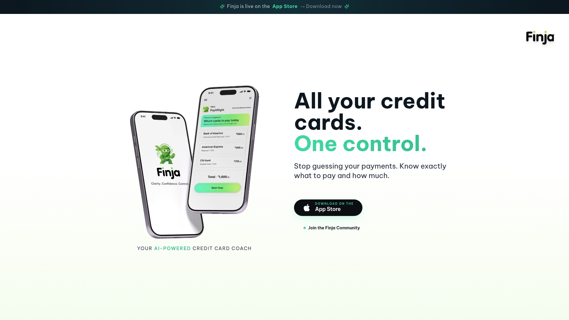
Finja is an AI-powered credit card management platform that gives you a real-time dashboard across all your cards, tracks your credit utilization, and surfaces personalized recommendations on when and how much to pay. Instead of logging into four separate bank portals, you get one consolidated view with the context you need to act. Finja's AI analyzes your spending patterns and recommends payment timing to reduce interest costs and protect your credit score. If you manage more than two credit cards, a smarter dashboard is not a luxury. It is the clearest path to staying in control.
FAQ
What is a financial dashboard for multiple credit cards?
A financial dashboard for multiple credit cards is a unified interface that aggregates balances, due dates, credit utilization, and transactions from all your cards into one real-time view. It replaces the need to log into separate bank portals for each account.
How many KPIs should a multi-card dashboard display?
Effective dashboards display 5–8 primary KPIs on the main screen. Showing more than eight metrics at once causes cognitive fatigue and reduces the quality of financial decisions.
How does a card dashboard update account data?
Secure aggregators connect to each card issuer and synchronize data every few minutes, providing near real-time updates rather than waiting for monthly billing statements.
Why should cards be ordered by APR on a dashboard?
Ordering cards by interest rate places your highest-cost debt at the top of your view, directing your attention to where action has the greatest financial impact. Alphabetical or bank-based ordering has no financial logic behind it.
Can a financial dashboard help improve my credit score?
A dashboard that shows real-time credit utilization across all cards lets you pay down balances before statement closing dates, which directly lowers the utilization rate reported to credit bureaus and can improve your score over time.